
Where Should You Place Your Labels In Your Form
UPDATE: Luke Wroblewski posted a link in my comments to his Best Practices for Form Design PDF. It is 100+ pages chock full of good usability information concerning forms. Thanks Luke!
James Avery writes about the Art of Label Placement in which he links to a few great articles on form design and label placement.
Web Application Form Design by Luke Wroblewski - This article covers the best ways to arrange labels and submission buttons.
Web Application Form Design Expanded by Luke Wroblewski - Another great article from Luke W. expanding on the same topics.
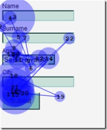
Label Placement in Forms by Matteo Penzo - Matteo takes Luke’s advice but applies eyetracking to evaluate how usable it is.
Based on these articles, James decides that non-bold labels above input fields are the best for usability. Interestingly enough, a non-bold label just above the form field just happenes to be my personal preference as well.
And now, I know why.
Matteo Penzo’s research using Eye Tracking provides some empirical evidence that this arrangement is more usable.
Comments
9 responses